Process

Piezography - Not for the faint of heart

Piezography Pro inks

Piezography Pro inks

I've been spending the past few weeks converting my old Epson Stylus 9900 printer to an OEM inkset, Piezography Pro, made by Jon Cone in Vermont. When I purchased my new Surecolor P9000 a few months ago, I debated whether to give my old printer away, sell it, or convert it to a B&W only printer. My interest in the Piezography inks started many years ago when I learned about the story of Jon Cone and his pursuit of quality prints from inkjet printers. I believe that one should understand as thoroughly as possible one's own choices for medium. We are all interested in achieving the highest quality output for our work and this I believe is the current state of the art for inkjet black and white printing. If you are interested in more information about Piezography, download the Manual in the Community Edition. Piezography Pro is a new version of the inkset that contains 10 inks and a gloss optimizer. You can produce an infinite variety of tone variations for highlights, midtones, and shadows using the warm toned and cool toned inks (4 of each). My previous B&W workflow used the Epson Advanced B&W Mode, which bypasses the ink profile system and manages the printing through a series of user selectable values for color toning and brightness. When Epson provided a 3 B&W ink tones (Black, Light Black, Light Light Black) this was touted as a revolutionary advancement, and indeed it is capable of producing impressive B&W prints. But there was always that inkjet look to them, something that hinted as a compromise, but you could not put your finger on it.

With the Piezography Pro inkset, there are basically 5 tones (HD Black, Dark Gray, Medium Gray, Light Gray, Very Light Gray) in a Warm and Cool variation, making a total of 10 inks. Then there is a one pass Gloss optimizer that removes any gloss differentiation due to unprinted paper showing. Only after looking at several of my prints with any areas of "white" did I see how prevalent (and distracting) this is.

I decided to flush my printer first with PiezoFlush which required a second set of refillable cartridges ($560). I had a stubborn Green channel and hoped that the flush would clear it up, which it did. Then I installed the Piezography Pro inks ($840 for the 250ml set) in another set of cartridges (btw, a set of 11 empty carts is $325). During the flush and installation, I'm sure another $150 worth of ink went into the maintenance tank, which filled up ($40). Piezography requires Quadtone RIP (QTR) software to send your file to the printer. QTR is shareware with a $50 donation. Printing is not as convenient as going directly to your Epson via Lightroom. Another learning curve. Speaking of curves, to get the most out of calibrating your system, you can "linearize" your output using a spectrophotometer (I have an i1Profiler). Lots of work. Is it worth it?

My preliminary tests using a "Proof of Piezography" test file shows dramatic improvements in the printing of dark shadow areas when compared to Epson's ABW mode. Where ABW prints as all black, I get a visible 10-level gradation. Impressive. How this translates to an improvement in print quality I will need more experience. Almost time to buy more ink.

proofofpiezography-21

proofofpiezography-21

Baptist Medical Center - Weaver Tower

 
Front installation view

Front installation view

On Tuesday we installed "Connected Stillness" in the Baptist Medical Center Weaver Tower, 1st floor lobby near the elevators. The 40 ft long installation depicts a typical morning at Cary State Forest, and combines photography and 3d elements. My hope is to offer a familiar, peaceful, and calming scene to those entering the hospital. It is a great privilege to offer this work to those who may need the power of art to move them to a higher place.

Installation view

Installation view

Gratitude goes out to my installation team Robert, Dorian, and Donald, my project co-collaborator Ryan Buckley of Gallery Framery, and my art representative Hillary Whitaker of Stellers Gallery at Ponte Vedra.

Cary Forest Study 632

Cary Forest Study 632

For the first time I was able to take one of my forest panoramas and incorporate it into an interpretive piece of art that reflects my intention for these large photographs. The forest extends horizontally and is momentarily interrupted by bits of the forest, natural branches that infill small alcoves between the canvases holding the larger print. These “bridges” connect the imagery together, and allow us to return back to the reality of the composition of the forest – wood, branches, and the interconnectedness of living things. The gaps must be jumped in order to progress visually through the 2-D composition.

The alcoves in the walls formed perfect pockets for the branches, allowing them to seamlessly fit in and provide the connection to the real world.

Branches

Branches

More branches

More branches

Those who have visited my studio over the past few years now know what I had in mind for those bundles of branches. I don't know why it took so long to develop this into a final idea. There was some experimentation on technique for the assembly and final finish. Overall I was pleased with the outcome and hope to extend the concepts with additional pieces.

From the plaque installed near the piece:

Artist: Douglas J. Eng
Title: “Connected Stillness”
Medium/Materials: Digital photography, archival pigment prints on canvas, natural branches
Location: Cary State Forest, Bryceville, FL
Date Photographed: April 22, 2016
Statement: The peace and stillness in a forest is present in all of us. Take a moment to look, breathe, and reflect on what surrounds you. Feel the stillness in the air and the warmth of the light ready to enfold you. Now go about your day with a renewed sense of being.

Face Forward - a slight departure

Face Forward Evite 
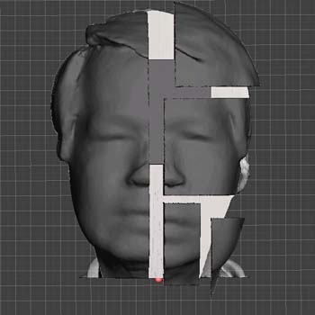
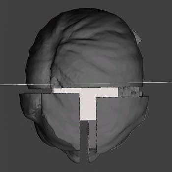
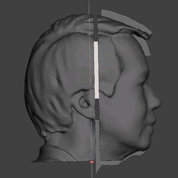
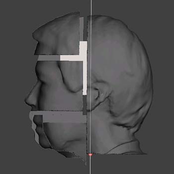
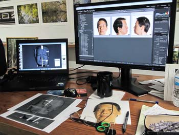
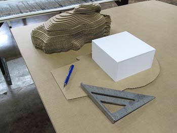
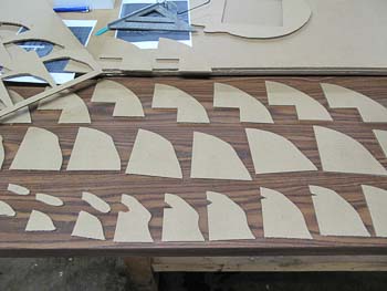
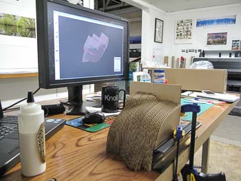
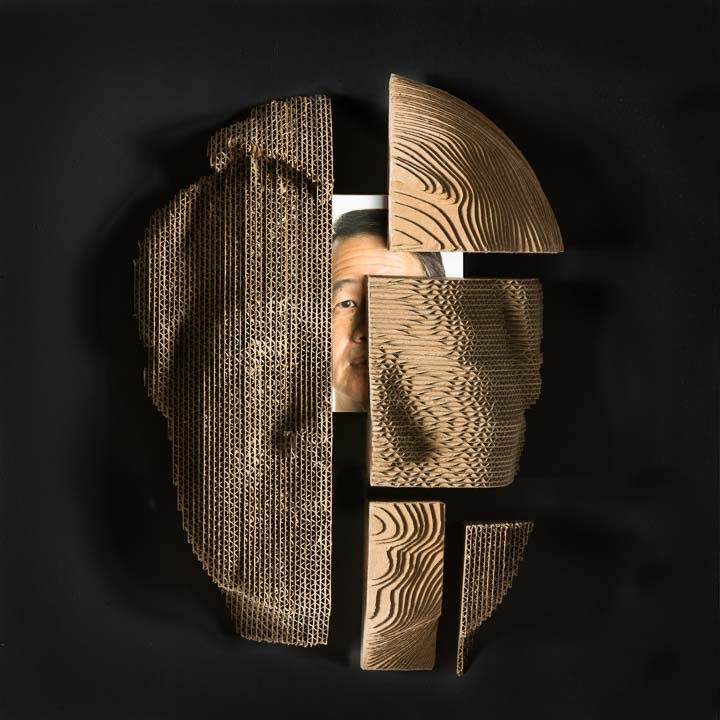
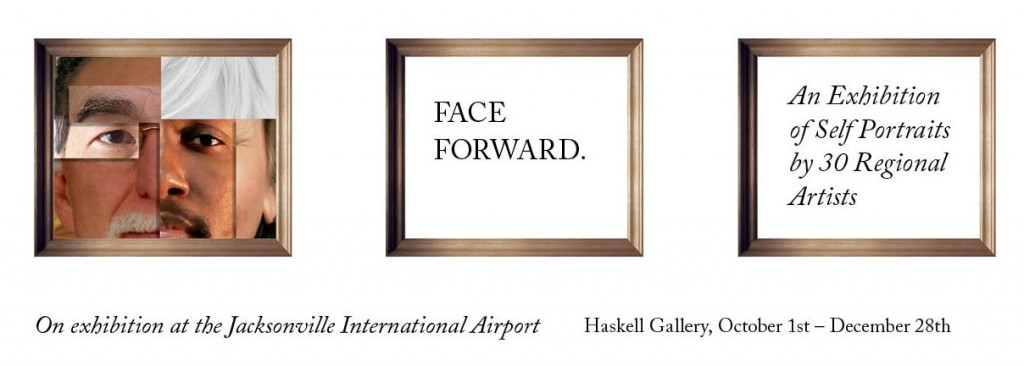
In March I received an invitation to participate in a group show, Face Forward, sponsored by the Jacksonville International Airport Arts Commission. The rules were simple, produce a self-portrait on a provided wooden panel, 24" x 24" x 2", any medium. Self-portrait? I don't do those. Asking around, I found that there were 30 artists asked to participate, most were heavy hitters...painters, sculptors, you know, "real" artists! I really wanted to do something more than photograph myself and paste it on a board. I thought this would be a perfect time to try something on the CNC router table sitting in the corner of my studio.

Unfortunately my schedule had been completely unreasonable since the Streaming South exhibit, with outside work, printing, and commercial commissions. So the time to experiment and "play" would be limited. With the deadline rapidly approaching I committed by writing up my submission proposal and dove in. My initial design called for a "decomposition" of the 3D contour map of my head revealing an actual photographic self-portrait within.

FaceForward001_front     FaceForward004_top

FaceForward003_left     FaceForward002_right

Here's a summary of the tools/software used to produce the piece:

  1. 3D scan using the Structure Sensor on iPad Air
  2. Skanect to generate mesh from scan data points
  3. Meshmixer to repair ear and simplify mesh
  4. Netfab Basic 6.3 to divide model into main pieces and carve out cube in middle of head
  5. Meshmixer to take each part and generate slices
  6. VCarve Pro to layout pieces and generate toolpaths for each slice using the Donek dragknife gadget
  7. Mach3 to generate P-codes for CNC

Believe me when I say this is not for the faint of heart, be prepared to do some digging and hacking into this workflow. It is not well defined into a nice easy to follow package. Once you have a working knowledge of the software, you must get your CNC working. Luckily I was cutting corrugated cardboard with a dragknife (utility blade) so I wasn't producing a huge mess of dust. I got through this project with 12 hour days for about 2.5 weeks. The final assembly and gluing the parts together was the most fun, but I could see where I needed to improve technique for future models.

FaceForward001_FaceForward_2015-0904-022     FaceForward002_FaceForward_2015-0904-024

FaceForward003_FaceForward_2015-0904-027     FaceForward004_FaceForward_2015-0905-030

On 9/10 I finally delivered my finished piece and on 9/24 the exhibit had a one night showing at the CoRK East Gallery followed by the installation at the Haskell Gallery in the Jacksonville International Airport.

In retrospect I felt I really went out on a limb on this one. It had a very high chance of failure and resulted in some extremely frustrating moments when nothing was working. I believe the process of producing art is difficult, and when it becomes easy and safe and predictable, we lose the magic of the breakthrough and/or discovery. We are built to be curious and to venture into the unknown. I'm glad I did.

"When you do something that is guarenteed to succeed, you are basically closing the possibility for discovery." - Milton Glaser

Replicated Self

Replicated Self

Mixed Media – Corrugated cardboard, pigment print

Self-portraits are typically well-defined for each medium. The ubiquitous “selfie” is made popular by the availability of cell phone cameras and elevates the self-portrait to an essential component of identity. “Replicated Self” is an experiment using a 3D selfie rendered to 3D forms. Using readily available tools and software, the captured 3D data provides a departure point for my first basic inquiry – deriving a “contour map” of my head and reconstructing the map in 3D using a CNC router table cutting corrugated cardboard. From here I begin a decomposition revealing my current state of discovery and curiosity about the process.


Facebook B&W Challenge

I spend my fair share of time on Facebook and try to keep my activity minimal, with a few posts of new work and events. Facebook is a great way to keep in touch, but I find myself wasting a lot of time just getting trough all the posts, most of which are totally useless. My high school friend photo-journalist Bruce Lipsky invited me to participate in the Facebook Black and White Challenge, which was making its way around. This challenge asks for 5 B&W images posted on separate days, with an invitation to 5 other photographers to continue the chain. I decided to oblige. I went through my archives to pull 5 different images from various projects. Most of my work is color so it wasn't too difficult to isolate 5 images. I do enjoy working in B&W because of the simplicity and directness of the result. In many ways it is more abstract than color because one dimension of realism has been removed. This allows the artist to insert their own dimension. I find that the fundamental concepts of composition, form, contrast, and metaphor are greatly enhanced. Here are the 5 images I chose to post.

Structured Harmony

Structured Harmony

"Structured Harmony" - Golden Gate Bridge, San Francisco CA 2011 - B&W Challenge #1. This photograph should be easily recognizable as one of the most photographed bridges in the world. I wanted to create a different view emphasizing the cable structure and it's relation to music, without the distraction of color, which is very distinctive for this bridge.

Open Hearts and Hands

Open Hearts and Hands

"Open Hearts and Hands" - Art Walk August 2011 at Main Street Park, Jacksonville FL. B&W challenge #2. Hearts and hands are symbols of love and friendship. This was a last minute shot of some children behind artist David Montgomery's projection screen after I instructed them to do something. I love to be surprised!

Luminous Morning

Luminous Morning

"Luminous Morning" - Jax Beach Pier, Jacksonville Beach FL, Dec 2011. B&W Challenge #3. Sometimes there is a special luminosity in B&W photos that surpasses anything in color. Glowing radiance or muted softness is best expressed in monochrome. I seldom venture out to the beach and on this rare visit I was rewarded with clouds and light.

Driftwood Tangles

Driftwood Tangles

"Driftwood Tangles" - Big Talbot Island, Jacksonville FL 2009. B&W Challenge #4. The "Boneyard" at Big Talbot is a favorite spot whenever I'm in the mood for studying the raw textures and forms of the fallen oaks that line the shore. It's hard to capture a successful image as everything begins to look the same. These studies are ideally suited for B&W because they are largely devoid of color. One can focus on dimensionality and gesture in the branches and try to make some sense out of the rubble. This scene reminded me of the complexities in nature and of our own lives and how eventually everything is reduced to drifting bones of wood along the beach.

Dock Alphabet

Dock Alphabet

"Dock Alphabet" - near Gulf Shores AL, 2011. B&W Challenge #5. Evidence of Hurricane Katrina's devastation in 2005 remain to this day. On a 2011 New Orleans road trip with Bill Yates, we found this to be a common scene. The arrangement looked like Kanji characters but I found no translation. It sorta speaks for itself.