Most of you know that I've been totally preoccupied with our project Message in a Bottle: Wall of Light for months now. May Art Walk was our big opening, and since I'm writing this long after the wall has been up and taken down, I can say with certainty that I'm glad it's all over. Having a project take over your life is exhilarating but brutal. I'm thankful that I made it through, with the help of Dorian, my brother Robert, and the support of many friends. But essentially it was my baby and I spent the last 2 months constructing the installation. Please check the MIB website for more details and if you can, spread the word of our message to all who are serving (and have served). The project is for them.
Scan Design Fall in Furniture Love
I was happy to receive First Place in Scan Design's 5th annual Fall in Furniture Love art contest. All entries needed to have furniture as their main theme. I racked my brain thinking I had no really fun images with furniture until I remembered the Red Chair Project. I think this photograph, Landing on Runway 13, has become one of my classics. I love this one! Many thanks to Scan Design for their support of the arts, and for the generous gift certificate for the award.
Alpine Groves and other nearby creeks
Continuing on my quest to visit local spots to capture the spring foliage, I stopped first at Alpine Groves Park located in Switzerland, FL. This was the site of an old citrus processing plant and the old barn and some equipment are still there. The park has a great dock overlooking the St. Johns and some wonderful moss-laden trees. This tree was on the river bank as seen from the dock.
From here I drove along Bishop Estates Rd. to the Flora Branch Creek bridge. This is a favorite road for cyclists and I've ridden through this area many times. More great leaf texture and color.
The final stop was the Bartram Canoe Trail trailhead off of Racetrack Road. It was quiet and peaceful with only the roar of the cars above. Had some lunch, took some pics, and then headed back to the studio. A great morning out.
Acosta night shots
Just an evening of shooting from the Acosta Bridge. Not much in the way of clouds tonight, so how about a traffic taillight shot? 10 sec @ f/18, 70-200mm f/2.8L @ 70 mm
Julington Durbin Preserve
This winter/spring I've made a commitment to get out to some new areas. Although I should be working on my other projects, I always seem to have an excuse for not photographing what's in my backyard. This weekend I attended a walking tour of the Julington Durbin Preserve with artist Jim Draper and naturalist Bill Belleville. This was the first time to this park and I was surprised that something so nice was so close to home. The meetup was at noon, so as suspected, the sun was in full force with no clouds. I decided to just focus on some of the leafless trees against the blue sky. The best part of the outing was finding this location, as I know it will yield some great images in the future.
On February 3 I made a follow-up visit in the early morning. The light was much better. This is Durbin Creek with some bright green leaves just starting out. How I love the early spring in Florida!
Art of Trees 2012
The Art of Trees is a benefit/exhibition conducted every year by Greenscape. This year the exhibit was hosted at Corse Gallery and Atelier, and I entered two pieces. I'm happy to report that Oak Canopy received a Merit Award which included a nice ribbon and some $$s. I was in very good company with some truly magnificent pieces all by local artists.
Help Portrait 2011
For the third year in a row I've participated in the Help-Portrait project at the Family Promise Center in Jacksonville. This year my good photo buddy, Gray Quetti stepped up to do all the shooting, and I have to admit he really knows what he is doing. We did the shoot on December 10, which is the national day for all Help-Portrait sites to shoot. Gray set up 2 Alien Bees, one in a medium sized softbox as the main and the other as fill bouncing off an umbrella centered above the camera. I usually shoot with lights on the right and left, and this is the first time I experienced the fill on axis with the lens. Gray set the white balance and tested exposure with his light meter. Call it old school but Gray did NO color or exposure corrections to over 900 shots. Typically I'm using the fill slider and tweaking the white balance on almost every shot. We managed to shoot 10 families. I was posing the groups and entertaining the kids.
Each family received a small photo album and CD with their images. We edited down to around 24 for each one, which turned out to be a tough job. Many thanks to Dorian who tackled the editing. Then we uploaded to Costco for prints. I've been very happy with the results from our local Costco (Allen and his team keep those Noritsu printers in top shape). I ordered some small albums from Neil Enterprises. The cost per album ($2 ea) is inexpensive, but they kill you on the shipping and handling ($18).
Gray and I dropped off the albums and were met by Becky Cravey and Bruce Lipsky from the Times Union. They were hoping to run a story over the holidays, which eventually appeared on January 2. Check it out here. Being present when the families received their photos was a big thrill. There were a lot of happy moms and dads.
If you haven't volunteered or given of yourself, especially over the holidays, I highly recommend it. I told the TU reporter that the photos taken on that Saturday will probably be cherished and appreciated more than all the photos I took during the year. It's a good feeling to know you made a difference in someone's day.
Sunrise at Jax Beach Pier
It's been a while since I updated the blog. I apologize to all of you who frequent my site to see what's going on. I hope you didn't give up on me. I don't know why we quit blogging...I think everyone who has a blog gets complacent once in a while. We'll see if I can get back on track.
Yesterday morning I decided to catch sunrise at the Jacksonville Beach Pier. It's something I've never done before, in fact, I don't know if I've ever watched the sun come up at the beach. Getting up early is tough for me. Add to that a 45 minute drive and it becomes tougher. The alarm rang at 5 AM and I did debate the decision, but I wanted to do this. I usually don't plan my days out. I've been lucky most of the time when I go out early. This morning was no exception. A front had come through yesterday and I was hoping for some clouds, but as I drove out in the darkness all I could see in the sky were stars. Bad sign. I hoped for the best and kept driving.
The Jax Beach Pier parking lot is at the corner of 4th Ave N and 1st St. Parking is free. There were a few surfers there although the wind was very calm and things were pretty flat. I didn't know what to expect and so I grabbed the tripod and a 70-200, with my 24-70 mounted on the camera. I always start out wide until I see what's going on. I took a few shots on the north side of the pier and then walked over to the south. There was another photographer there which ends up being problematic because usually other photographers gravitate to the spots that are naturally good view points and they just park themselves there. Finding other positions where you are not including them in your image can be a challenge. I like to walk around, but this couple stayed in the same spot all morning.
The pre-dawn sky was great and as sunrise approached the sky began to light up. There was a small band of clouds right above the horizon which is good. If there are no clouds, once the sun comes up it will burn out and attempts to shoot in that direction. I knew I would get multiple chances to include the full sky in my compositions as the sun rose and went behind the clouds. As the morning progressed I also noticed a bank of clouds from the north heading south. What was a perfectly clear sky would eventually be filled with clouds. Perfect.
After shooting for about an hour around the pier I decided to pay the $1 and walk onto the pier itself. There were a few people fishing but for the most part it was pretty empty. By this time the clouds had made their way across the sky and I waited patiently for the sun to be obstructed. You can see from the images that the light was great. Around 9:00 I decided to call it a day. I had taken about 140 images and was ready for breakfast at the Beach Hut Cafe on 3rd St (and 13th Ave). A great place for a home cooked breakfast. I'm hoping to get out to the beach more in 2012, and to focus on more regional areas.
December Arbus cover
I was thrilled to have my amaryllis photo on the Arbus December cover. These photos were from a dining room table shoot on January 1 of this year.
The issue also contained 3 other stories about projects I'm involved in: Message in a Bottle (page 12) , CoRK (page 14), and the Pop-up Galleries at Main Street Park (page 20). Many thanks to Cinda Sherman at Arbus for her dedicated support of the arts in Jacksonville.
Message in a Bottle: Wall of Light
I'm close to launching a new project that I'm super excited about. It was conceived originally as an art project based on our activity at Main Street Park for the past 2 months. I wanted to create something in the large planter that runs the length of the block. I envisioned a sculpture that could be illuminated and portray the flowing characteristic of our river and ocean. After deciding on recycled water bottles as the construction material, I concluded that at least 30,000 bottles were required to make something effective. Then I watched the memorials on 9/11. I was emotionally impacted. There are people who give freely of their lives for a higher purpose. I wanted this art to be about those people.
What if each bottle contained a message to our military troops, and what if these messages in a bottle were provided by the people of the city? What if we recorded these messages into a collective voice that could be communicated to our troops and their families? My job would simply be to facilitate the collection, post the messages on a website, and construct the wall with the bottles. This is what our project is all about - a message of gratitude to those who serve. Please read all about it here: http://messageinabottlejax.com/
IPA Awards - 2011
My last submission of Straight and Twisted to the IPA won an Honorable Mention in the Professional Category - Trees. I remember agonizing over what category to use, Professional or Non-professional. I figured I'm a professional now so I went for it. This is a huge competition with hundreds of awards, so I'm careful not to be too excited about this, but it's good for the ego to be selected once in a while. I have my share of rejections for sure! The exercise of submitting and keeping your work in a form where you can efficiently submit is a good practice. I'll do 3-4 submissions a year if I feel my work fits well in the call. IPA is great in that there are categories for everything, and you can spend a fair amount of time looking at some great photography from previous winners.
Fine Art Print Workflow
Here is something to try if you want to test your skills as a photographer and printer:
Obtain a painting from your favorite watercolor artist. In my case, it's my studio mate Robert Leedy.
Photograph the painting.
Make any adjustments in your favorite software.
Make a print of the painting, same size as the original, on fine art paper, and show it to the artist.
Ask the artist if they feel the print matches the original. If not, repeat Step 3-4. Continue until you run out of paper or the artist is satisfied, whichever comes first.
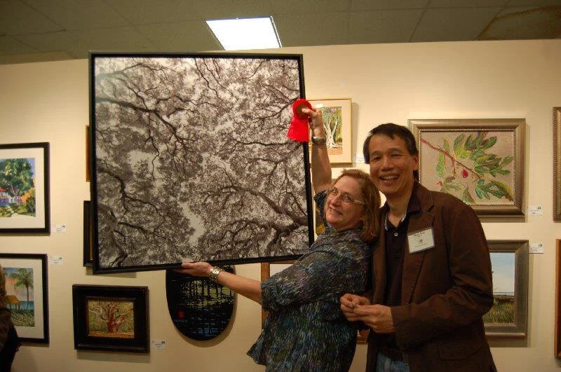
I was asked to photograph and print 5 paintings for Robert last week for his upcoming show, Beach Access. I eagerly agreed, not knowing what lay ahead. How hard could this be? I have a good camera, daylight balanced continuous lights, a calibrated NEC 2690 monitor, printing to an Epson 9900. Just take the shot, make the print, right?...not so fast. The first test print on 8.5x11 enhanced matte paper (a lot cheaper than the Hahnemuhle William Turner paper selected for the finals) was close. I started out in Lightroom and felt it was just a matter of getting the white balance and saturation tweaked. After about 4 test prints I started to get that sinking feeling. The blues were extremely problematic, and these paintings had lots of blues, different shades and hues. In fact, I don't even know how to describe them. And lots of subtle transitions to yellows and oranges. Robert describes them as "complex." Watercolors are particularly problematic. The colors are created through transparency, that is the only "white" is what is left of the paper that shows through. Much like the colors on your computer monitor. Which means the white balance is actually not white, but the color of the paper. In addition, the paper I'm printing on has a different white balance. Ok, so I'm sorta screwed on this. And yes, although they say a calibrated monitor matches the print exactly, well, it just ain't so. Either my eyes haven't developed the sensitivity to "see" a color match from a monitor to a print, or my system is still off somewhere. Admittedly, the conditions in my studio are not optimal... fluorescent lights, dirty lens covering the lights, some natural light from a window, no shade on the monitor, no balanced light for viewing the print. Horrors!
At some point I through in the towel on Lightroom. It seemed like some of the colors were ok. The reds, greens, and darker shades seemed to be more tolerant of my bad white balance. But those blues and yellows were off. It was on to Photoshop, and masking areas so that I could keep intact what looked good. It seemed like I was going around in circles. Plenty of adjustment layers...Levels, Curves, Hue/Saturation, and White Balance. There's always more than one way to skin a cat in Photoshop. Robert was always helpful in the process. He could tell me, "Doug, this color is way off...add some red here, take out yellow there." Without his clues I would be stuck. For me the blue just needed to be "more blue," whatever that meant!
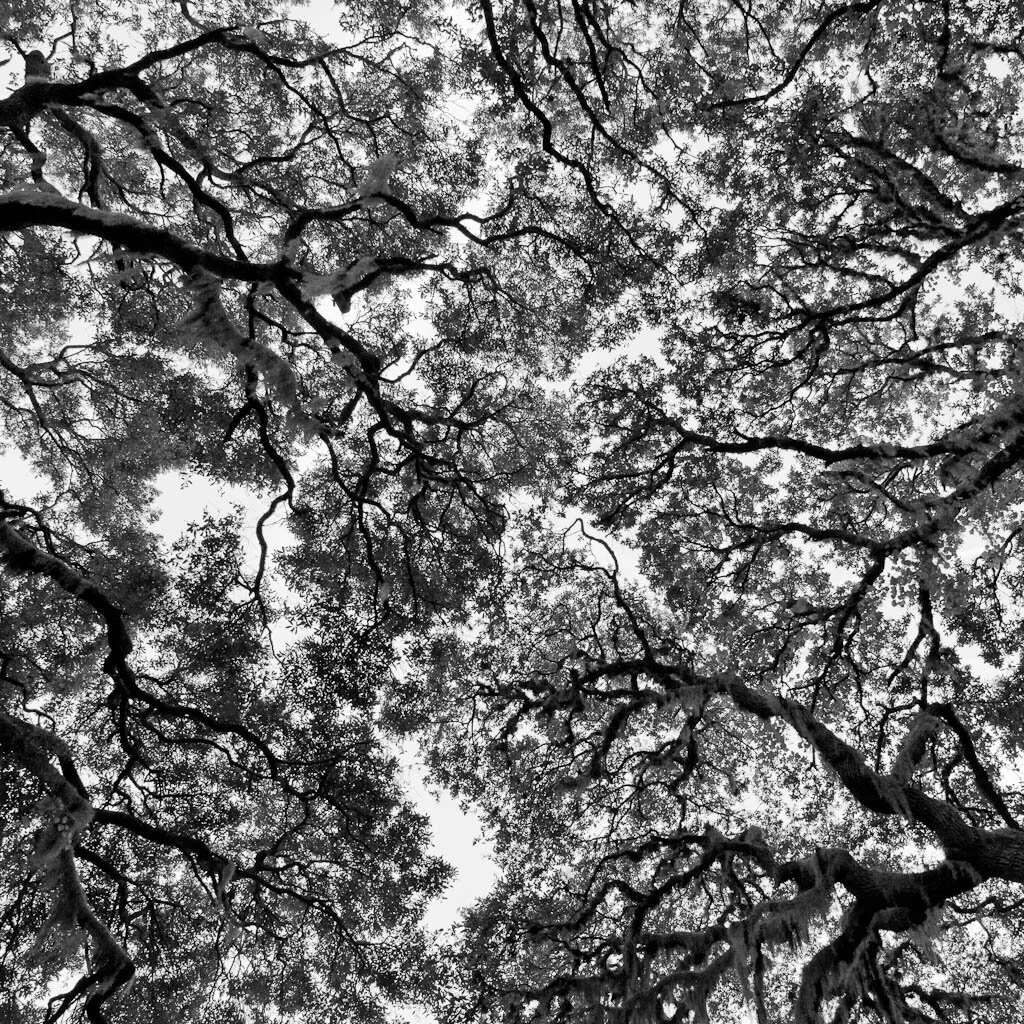
The next big realization was that an 8.5x11 (really a 9x6) print may look fine, but not all things scale up to 26x18. In fact as we all know, a lot of glaring details start to appear, and the perception of color is no exception. I was in shock to see that what I though was pretty good was actually pretty bad, and I had the large print to prove it. So I went to printing test strips at full size just to get close. After blowing through about $300 worth of paper and ink, I got through each painting. The results are good, not great. If I expect to be doing fine art print services on an ongoing business, I need to go back to school on this. My goal is to arrive at a 90 minute process. If not, then it's something I can't afford to do, or a typical artist can't afford to pay.
IPA Awards
Last year I entered several images for the International Photography Awards and just discovered (quite by accident) that I won an Honorable Mention - Cityscapes for my City Views Submission. I guess they never formally announced any winners, so when I went to submit again for 2011 I started browsing the last year's winners and found my work. What a surprise! I think I'll print myself a little certificate that I can hang on the wall. I find myself entering a lot of these competitions and forgetting about them...bad habit. Is going through the exercise of submission and the paying fees worth it? I think by being selective, one can hone your skills of efficiently submitting work, which is something you need to do when applying for grants and proposals. This has to be in order, or you'll spend an inordinate amount of time responding to these requests. Have your resume, artist statements, bio, and lo-res image portfolios well organized and handy. I've spent days working on a proposal...felt a lot like doing your taxes! Get your stuff organized and make it easy for yourself. And you may get an award to post on your resume!
July 4th - Family, fun, and fireworks
July 4th is always a good holiday to divide up the year and reflect on what has happened and what is yet to come. I was fortunate to leave the heat and humidity of Jacksonville to spend a few days with Diana's in-laws and Dorian's brother in Ohio. We enjoyed fireworks on July 1 (an early tradition up here) and 3 days of continuous feasting. Being with family always has it's benefits.
Fireworks photography is always fun if you can find a decent spot and the weather cooperates. I regret all those summers I spent in Montreal and never photographed the International Fireworks Festival competitions...oh how I wished I was there for the summer. I experienced the fireworks at Buckeye Lake which is about 40 miles west of Columbus. They say the show is one of the best in the area and it did not disappoint. Almost 30 minutes of explosions. We were able to view them from a house on the lake, no long wait for a spot. After some dismal results with my 24-70 lens, I switched over to my 70-200 and went for some closer shots and details. Not having a clear view of the lake posed some challenges and I wasn't able to get many shots with the reflections in the water.
There are lots of articles on camera setup for fireworks (just Google "fireworks photography"). My settings were ISO 400, f/10, with an average 2 sec exposure. Cable release and tripod are essential. You want to be careful of not blowing out the highlights, so these settings depend somewhat on the distance you are from the show and the number of explosions happening at one time. Be prepared to adjust the ISO and aperture to account for this (check your histogram or flashing overexposure warning). Another convenient setting is to use your "B" mode and just count down the seconds. This gives you more control over when you want to stop the exposure, especially when you see another firework starting to enter the frame. I actually forgot about using "B" and many of my shots ended up with a new firework entering the frame, something to remember. I'm paranoid about focus, and since everything is pitch black you wonder what you should be focused on. You can pretty much go to infinity and just back off a tad. Shooting at f/8 or above will ensure that the lights will be in sharp focus.
While waiting for the show you can always play around with moving your camera on the surrounding lights. This will help you warm up and to get an idea of the exposure.
I post-processed all images in Lightroom and needed to increase the Blacks and Vibrance. Of course some cropping helps to isolate the patterns. I was thankful for the resolution on the 5D2, zooming in on some of the light trails revealed some very interesting patterns. Shooting tight with the telephoto gives a different perspective on the scene. I know that we get caught up in the grandeur of the big circular clouds, but try to isolate for a different look. The half hour show went by quickly. It's nice to have images to relive the moment.
White Oak Conservation Center - Arts and the Environment
45 miles north of Jacksonville, on border of Florida and Georgia along the St. Mary's River, lay 7000 acres of pristine woodlands and fields. Housed on this compound is an amazing assortment of animals, studios, and a wildlife conservation center. This is White Oak, home to white rhinos, giraffes, okapis, cheetahs, and the Baryshnikov Dance Studio. I was asked by Cinda Sherman of Arbus Magazine to accompany her to view the Jacksonville University MFA dance troop completing a week long summer retreat. It was my first time to White Oak, although I've heard about the animals many times. I did not connect Annie Leibovitz's famous "White Oak Dance Project" with this location. Here she photographed Baryshnikov and other famous dancers back in the 90's. I was feeling the power of the place. I also met dance legend David Parsons. The facility is quite amazing but the combination of environmental and arts advocacy is what struck me as unique. And to know that this center is so close to Jacksonville! More on White Oak can be found here. I'm thankful that the Gilman family chose to invest in such a project.
The morning was spent photographing the dancers as they went through a warm-up and choreography exercise. The room was quite large and I brought 2 Speedlights. I really didn't know what to expect and needed to travel light. I set one up on opposites sides of the dance floor and just worked them from there. I wanted to be as unobtrusive as possible. I have gained quite an appreciation for dance and enjoy the energy and flowing controlled movement of the dancers. It is beautiful to watch. I find a great aesthetic to how the individual bodies and arms, torsos, and legs are moved into positions and then as each dancer makes contact and positions themselves in proximity to the other dancers, the composition becomes alive. This is fascinating.
After about an hour of photography we were given a tour of the okapi area, only one of several breeding centers for endangered and threatened animals. We got to be up close and personal with a group of okapis, gentle animals related to the giraffe but partially striped like a zebra.
I was exhausted after the day, but totally inspired not only by the dancers but by the history of the facility for dance, photography, and conservation. What a legacy. I also found and ordered Leibovitz's White Oak book on eBay. Can't wait to get it.
We really need some rain
It's been very dry this summer and our area of town (Mandarin) seems to be dodging the afternoon showers all week. I drove through a deluge coming home today but only a few drops fell in the neighborhood. I took a drive out to one of my favorite spots down the road to check out the clouds hoping to see some monster rain approaching. Lots of gray skies and this one cloud over the skyline. No more rain for today...let's see what tomorrow brings.
Friendship Fountain flows again!
Jacksonville's icon, Friendship Fountain is back in business after many years of "barely working". The fountain opened in 1965 to much hoopla and I remember it being a very big deal when growing up. The fountain was always the gateway to our city, and we were all very proud of it. So when it came time for the renovation planning in the middle of the recession, you can imagine the battle that had to be won. 3.1 million is the final price tag, but I'm glad we did it. We need symbols that we can be proud of, it lifts the spirit and is a joy to see. I hope everyone in Jacksonville comes downtown to see this new incarnation.
My only beef with the fountain is the music and light show. Listening to patriotic music (Lee Greenwood's "God Bless the USA" among many other favorites) and the disco lighting is a bit much. Knowing that the whole system is programmable through some nifty software makes you want to go in and do something really creative. I'm inquiring as to how we can get some visual artists and musicians involved in improving the quality of the shows.
Memorial Park
Memorial Park in Riverside is one of the most photographed parks in Jacksonville. It is located at the "bend" in Riverside Avenue and features a statue "Life" by Charles Adrian Pillars. The park was actually designed by the Olmstead Brothers who's father, Fredrick Law Olmstead designed many of the famous parks in the US (Central Park, the Washington Mall, etc.). Memorial Park is dedicated to the Floridians who perished in WW1.
The park faces South, S-E so the trees on either side are mostly in shade except for the late afternoon. Lots of people are usually milling around, fishing, and taking pictures. To find a different shot is challenging, and dodging the people is almost impossible even in the early morning or evening. My first attempt came during the week that several wildfires were burning in the Okeefenokee Swamp creating a weird orange cast to a cloudless sky sunset. I ended up replacing the sky with an orange gradient in Photoshop for the final image. The two compositions I worked with are the standard symmetrical front shot and another shot that had the Park Lane Condominium opposing the statue. Both were shot as 3 shot panoramas.
Next Step Exhibition at Renaissance Gallery
I belong to a group of distinguished photographers called The Next Step who are selected alumni from John Paul Caponigro's workshops. Several of us are participating in a group showing of work at various venues throughout the country. Our first opening was in Rockport, Maine at the Maine Media Workshops and our second was here, in Indianapolis at the Renaissance Gallery. The gallery is actually located in Carmel, Indiana at the center of the Arts and Design District. There are 23 artists participating and our exhibition catalog is published on Blurb.
I am showing two pieces from my Straight and Twisted series - Illumination and Renewal. Each are framed 30x30 in heavy dark wood with a gloss finish. This framing was selected by Donald Dusinberre and I was very pleased with the way the presentation turned out. Framing for prints is like clothing to the person...need I say more? Usually I am looking for low-cost solutions to protect my prints. Since I'm not a "clothing" sort of guy I tend to go with jeans and t-shirts. Sometimes this just doesn't cut it, especially when your art needs to convey a sense of inner beauty, stability, and long term value. This is a tough lesson and an expensive one, considering the number of prints I would like to display. A client needs to be able to visualize your artwork in their office or home. A $15 frame doesn't help.
An evening with the Sierra Club
Tonight I spoke at our local Sierra Club about image design and the art of nature photography. It was great to meet some new friends and I always enjoy yakking about my work. I showed about 60 images from our national parks as examples to explaining image design principles taught to me by Freeman Patterson and Brenda Tharp. At some point in your development as an photographic artist you want to go beyond camera skills. Learning how to “see” is the basis for developing your own style of photography. I recommend highly the following 2 books if you are ready to progress: Creative Nature and Outdoor Photography by Brenda Tharp, Photography and the Art of Seeing by Freeman Paterson. Most nature photographers have some connection to the Sierra Club. It may be significant or indirect. All who enjoy our National Parks and the results of conservation movements can give thanks to organizations like the Sierra Club, who had the early foresight to raise the red flag to so many situations that had the potential to destroy our natural treasures in the name of progress and industry. My introduction came in high school, where I by chance picked up a 1972 Sierra Club Engagement Calendar. It was one of those spiral bound datebooks with a beautiful image for each week. I remember being fascinated with the photography, not only the technical quality but the beauty and interest in each image. Where were these places, what were these rocks, plants, and details, how could I create images like these? I wanted to know and do.
Back in those dark ages, photography could only be enjoyed by books and magazines. I never had access to viewing a fine art print until much later. Fortunately, the Sierra Club and Ballantine Books had a series of larger format paperback books with inspiring photography. Everytime I went out to photograph, I can remember trying to reproduce those classic images of trees, flowers, and landscapes in these beautiful publications. It’s interesting to view an old book that influenced you. Most of the time I’m so impressed at what was accomplished with film, and how the “style” of nature photography promoted by Ansel Adams, Eliot Porter, David Meunch, and the likes continues to influence nature photography today. That’s why I love used book stores, because it’s fun to see where your photography came from. And I’m still looking for that engagement calendar.